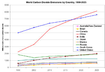
 There are a variety of different ways of talking about greenhouse gas emissions. Each makes sense within its own context, but unlike different pronunciations, you need to take them all into account to make sense of the situation. It isn't a simple matter of choice.
One way, as in the chart to the left looks at total emissions by country. Given the current political arrangements of the planet -- where policy implementation is made at the level of the nation-state, this view gives a sense of the overall 'contribution' of each country to the problem. This view has the practical benefit of pointing out that the two countries most responsible for the increasing level of emissions (the US and China) are also the main players currently outside the Kyoto process. And, as discussed in some earlier posts, the ones most at odds with each other over the next step; the development of a policy framework to replace Kyoto.
Another way of viewing emissions, as shown above, is on a per capita (per person) basis. Viewed in this light, we see that China's contribution remains comparatively small -- the total contribution is large because of the massive population of the country, the average contribution per person remains substantially less than in the developed world. While a bit dated (the information only goes up to 2004) the above chart is dynamically connected to a data set that allows you to play around and look at it in different ways. Try it out!
For more on carbon emissions by person, see this article.
yurtdışı kargo
ReplyDeleteresimli magnet
instagram takipçi satın al
yurtdışı kargo
sms onay
dijital kartvizit
dijital kartvizit
https://nobetci-eczane.org/
1R13CP