Sunday, July 22, 2012
Summer break / links
Individuals wanting substance, can head on over to Collide-a-scape where there is an interesting discussion going on About the New Energy Revolution.
Individuals interested in visuals should check out Palíndromo Mészáros photos documenting the effects of a massive toxic aluminum spill in Hungary. The photo below isn't photoshopped or a before/after photo. The red line represents the height of the toxic sludge. The photographer cleverly selected the camera height in order to create the effect. Details and other amazing images at American Photo.
Saturday, June 16, 2012
The Heat is On at Climate Central
First there was the fascinating Surging Seas, which interactively lets you see the danger from sea level rise and storm surge along the US coast. Now they have released, The Heat is On, an interactive map based on the average daily temperatures for the continental 48 states from 1912 to the present, and also from 1970 to the present. Along with the wealth of data on individual states, the site documents two broad trends:
- Warming rates accelerated everywhere after 1970
- The rate of warming varies dramatically from one state to another.
Friday, February 24, 2012
Mitch Dobrowner's Epic Storms
Wednesday, January 25, 2012
Systems: Economic and Ecological
-
Simon Johnson in The Libertarian and the Lobbyists explores the role of government regulation (or lack thereof) on the recent financial crash. Of particular interest is the discussion of the findings from two recent IMF reports by Prachi Mishra analyzing lobbying practices in the US.
Legislators, of course, have different preferences about what kinds of laws to support, which can make it hard to study mechanisms of political influence precisely. But Igan and Mishra approach the problem in a clever way – they look for instances when elected officials switched their position on legislative proposals that surfaced more than once. And they devote a lot of effort to figuring out what caused this switch. ...
A big increase in lobbying expenditures helps to persuade legislators to switch their votes. And “whether any of the lobbyists working on a bill also worked for a legislator in the past sways the stance on that bill in favor of deregulation.” It is deregulation, of course, that financial firms want – fewer rules and less oversight of any kind. And it really is all about whom you know, and how you know them. In particular, your value as a lobbyist seems to depend very highly on whom you worked with in the past. Igan and Mishra find “spending an extra dollar is almost twice as effective in switching a legislator’s position if the lobbyist is connected to the legislator compared to the case where the lobbyist is unconnected.” ...
Essentially, financial firms have been buying the right to take on more risk. When things go well, executives in these firms get the upside – mostly in terms of immediate compensation, because few executives are compensated on the basis of risk-adjusted returns. That means that when the risks materialize and the firms suffer losses, the costs fall on taxpayers.
Ron Paul is right to point to imbalances of power and massive distortions within the financial sector. He is also correct that many government policies favor relatively few big firms – and favor them in a way that encourages excessive and dangerous risk-taking.
But Paul and others are wrong to argue that the government is the ultimate cause of all financial evil. Executives in financial firms want to take big risks. They like arrangements under which they win even when they lose.
Big financial firms can more readily buy the necessary political protection (in the form of deregulation), enabling them to become even bigger and more dangerous. This incentive structure has only become more extreme since the financial crisis of 2008. -
Erle Ellis describes the findings of his most recent publication, All is Not Lost: Plant Biodiversity in the Anthropocene, as:
the first spatially explicit global assessment of contemporary patterns of terrestrial plant biodiversity (native loss + exotic species gain) at regional landscape scales.The main result: humans have caused a net increase in plant species richness across two-thirds of the terrestrial biosphere, mostly by facilitating species invasions. In most regional landscapes, native species losses were significantly lower than exotic species gains, with agriculture species causing minor increases, but ornamental species sometimes play a large role that is still hard to assess.
While I'm not convinced Ellis's focus on the shift from biomes to anthromes captures the most fundamental characteristics of the Anthropocene, the work is both provocative and, as a result of his heavy use of maps, visually interesting. A number of relevant links are contained in this post by Andrew Revkin.
Friday, December 16, 2011
Friday, August 26, 2011
It was 45 years ago today ....
Lots of people are familiar with the later, color version, taken by the Apollo astronauts a few years later. The emotional impact of the more famous image -- a blue/living planet set again the black/lifeless moon -- is undeniably greater ... but this is the original.
Tuesday, August 16, 2011
Beautiful (and disturbing) images of the American drought
Wednesday, July 13, 2011
A Is for Armageddon
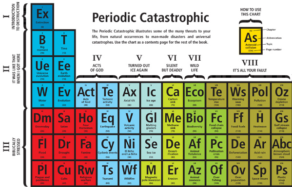
With all the doom and gloom of the past couple years, you can't blame Richard Horne (author of 101 Things To Do Before You Die) for taking the piss out of the doomsday message with A Is for Armageddon: A Catalogue of Disasters That May Culminate in the End of the World as We Know It.As they put it over at BrainPickings,
From religious warfare to grey goo to deforestation, Horne combines science, superstition and sociology in a beautifully illustrated, delightfully dystopian guide to the apocalypse. Underlying the wickedly entertaining tone, however, is a grounded, non-preachy crusade for awareness that exudes the call of urgency none of us want to hear but all of us must.

Opening with a Table of Contents that riffs on the periodic table of the elements, this is a book that make you laugh while it educates. Lots of photos follow. Click on them to get to the full size versions where you can read the text. If you haven't had enough, be sure to check out Slavoj Žižek’s Four Horsemen of the Apocalypse in One Minute (the Elvis of Cultural Theory only comes up with four impending catastrophes!) and, for an antidote, An Optimist's Tour of the Future.
Wednesday, March 23, 2011
Yann Arthus-Bertrand
Yann Arthus-Bertrand is the French (and, perhaps, more populist) version of Canada's Edward Burtynsky -- a photographer who uses the camera to describe the impact of humans on the planet.In contrast to Burtynsky, who uses the monumental size of his photographic prints to memorialize the scale of human impact, Arthus-Bertrand is best known for his book and the associated UNESCO sponsored traveling exhibition, The Earth from Above.


Taken from the air, Arthus-Bertrand's images tend to be more abstracted and more traditionally beautiful than Burtynsky's. His aim appears to be to show the beauty of the planet, and thereby to promote love for it where Burtynsky tends to focus, albeit in ways that are visually stunning, on the impact of humans more than the beauty of the planet. Indeed, much of the environmental punch of both the Arthus-Bertrand's book and the exhibition come from the substantial amount of associated text that accompanies each image rather than the image itself. Arthus-Bertrand now has a film, Home, with much the feel of an IMAX film depicting the earth from above and available here on YouTube.
The Guardian recently posted an interesting article about him, Yann Arthus-Bertrand: Looking down on creation.
Sunday, January 16, 2011
Hottest year on record: A Visual Memorial
The high temperatures were matched by a decline in Arctic sea ice. Arctic sea ice extent averaged over December 2010 was 12.00 million square kilometers (4.63 million square miles). This is the lowest December ice extent recorded in satellite observations from 1979 to 2010, 270,000 square kilometers (104,000 square miles) below the previous record low of 12.27 million square kilometers (4.74 million square miles) set in 2006 and 1.35 million square kilometers (521,000 square miles) below the 1979 to 2000 average. The extent of Arctic sea ice has declined 3.5% per decade between 1979 and 2010.In recognition of these milestones, we are highlighting a specific work by Canadian artist Diana Thorneycroft from her series "Group of Seven Awkward Moments." Thorneycroft describes the purpose of the series as follows:
In this new series "Group of Seven Awkward Moments", I investigate the relationship between the Canadian landscape and national identity. Reproductions of paintings by the famous Canadian collective The Group of Seven are used as backdrops to the dioramas I photograph.
It is through the use of the collective's iconic northern landscapes, which have come to symbolize Canada as a nation, combined with scenes of accidents, disasters, and bad weather that gives the work its edge. By pairing the tranquility of traditional landscape painting with black humour, the work conjures up topical and universally familiar landscapes fraught with anxiety and contradictions.
The image immediately below is "Icebergs, Davis Strait (1930)" by Group of Seven artist Lawren Harris. At the bottom is Thorneycroft's riff on the image. Enough said.

Monday, December 13, 2010
Generosity: Real and Imagined

There is a lot going on here. On the one hand, American's perceive themselves as a generous people and, I think, that sensibility is reflected in the magnitude of the "should spend" allocation. On the other hand, there is a perception that the government is actually spending roughly double what they "should spend." This is remarkably consistent with a
Gallup poll documenting the belief that Uncle Sam wastes 50 cents on the dollar. This sentiment explains the effectiveness of the simplistic political rhetoric claiming it is possible to balance the budget by getting rid of waste, fraud and abuse. Finally, there is the implicit point that Klein constructed the graph to illustrate -- that American's would be willing to give more to foreign aid if they actually understood how little was currently being spent. I doubt that is true. Indeed, if the question were phrased differently I suspect you would get very different results. For example, asking Americans to estimate the amount of money actually spent on foreign aid rather than the proportion of the budget, would, I suspect, yield a number substantially lower than the actual dollars involved.
Sunday, October 31, 2010
Sunday, October 24, 2010
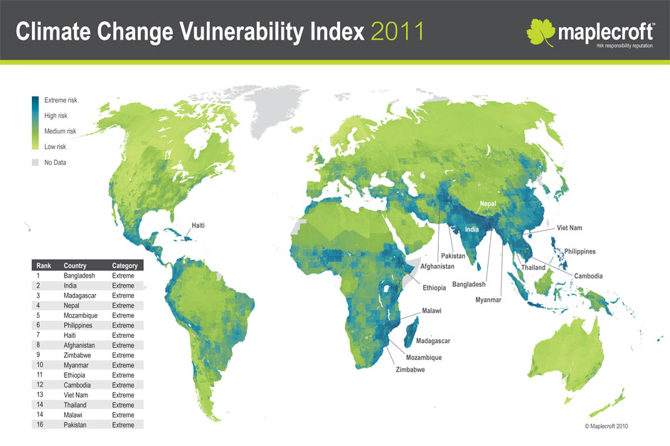
National Vulnerability to Climate Change: 2040
The results, summarized by the accompanying map, rank countries from extreme to low risk. A number of countries projected to be major economies of the future are among those with either extreme (Bangladesh, India, Philippines, Vietnam and Pakistan) or very high (China, Brazil, Japan) levels of risk. The Guardian summarized the report as follows:According to Maplecroft, the countries facing the greatest risks are characterised by high levels of poverty, dense populations, exposure to climate-related events and reliance on flood- and drought-prone agricultural land.
Bangladesh ticks most of these boxes and the report warns that rising climate risks could hit foreign investment into the country, undermining the driving force behind economic growth of 88 per cent between 2000 and 2008.
Similarly, the report warned that India's massive population and increasing demand for scarce resources made it particularly sensitive to climate change.
Other Asian countries attracting high levels of foreign investment such as the Philippines, Vietnam and Pakistan were also classified as facing 'extreme risk' from climate change, while industrial giants China, Brazil and Japan are listed as 'high risk'.
"This means organisations with operations or assets in these countries will become more exposed to associated risks, such as climate-related natural disasters, resource security and conflict," said Dr Matthew Bunce, principal environmental analyst at Maplecroft. "Understanding climate vulnerability will help companies make their investments more resilient to unexpected change."
Some states were not listed because of a lack of data, including North Korea and small island states such as the Maldives that are vulnerable to rising sea l evels.
Wealthy European nations made up the majority of low risk countries, with Norway, Finland, Iceland, Ireland, Sweden and Denmark deemed to face the lowest risk of climate-related disruption.
However, Russia, USA, Germany, France and the UK were all rated as 'medium risk' countries.
Tuesday, September 28, 2010
Erosion
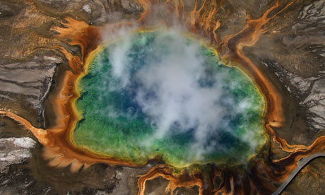
While looking for data comparing the amount of earth moved by human processes with that moved naturally, I came across this beautiful image and its related story. The picture shows a curl of sand and dust from the Sahara desert blowing west over Africa and across the North Atlantic before heading north at the Cape Verde islands. The Sahara contributes about half of all of the dust dumped into the atmosphere every year. According to research reported in the New Scientist, much of this dust comes from a single valley in the Sahara and ends up fertilizing the Amazon basin.
The trees and plants in the Amazon rainforest rely on nutrient-rich dust from a single valley in the Sahara desert for sustenance, researchers have discovered.
Scientists know that millions of tonnes of mineral dust are blown from the Sahara desert to the Amazon basin each year. The dust helps keep the Brazilian rainforest soils fertile.
Now, researchers have found that 56% of this dust comes from one place: the Bodélé depression in Chad, Africa. They also showed that three times more dust than previously thought is transported each year from the Sahara to the Amazon - over 40 million tonnes.
.....
The Bodélé valley is 200 times smaller than the Amazon basin, and forms only 0.2% of the Sahara itself. The reason the valley supplies so much dust is its location between two mountain ridges. It forms a funnel that accelerates the flow of air, not unlike a wind tunnel, allowing more dust to be carried. In winter, the valley produces an average of 700,000 tonnes of dust per day.
For more details, see Environmental Research Letters (DOI: 10.1088/1748-9326/1/1/014005)
Thursday, September 23, 2010
Inequality and Cohesion
While there is little agreement on precisely what level of difference is most appropriate (or if there is even such a thing as a single best appropriate level), there is broad agreement that tilting to the extreme in either direction can be problematic. Too little income differential and economic productivity suffers as the rewards and motivation for productivity are removed. Too much income differential and social cohesion suffers as feelings of exploitation or hopelessness spread. In an age of cheap and powerful weapons, the results can be tragic and equally disruptive to economic productivity as many countries in Latin America and Africa have discovered.
Slate contributor Timothy Noah has recently completed the fascinating series The Great Divergence, available in its entirety as a pdf file here. While the increase in income disparity within the US has been the topic of discussion for many years, the series is notable both for placing the debate in the context of a longer historical frame and for the the breadth of the research and explanations it examines.

As the above above graph shows, income disparity within the US has been increasing rapidly since the late 1970's. The difference between rich and poor is now as great as it was at the end of the Robber Baron era. More interesting to me, particularly in light of the current debate about taxes in the US, is the data below taken from the work of Princeton political scientist Larry Bartels (author of Unequal Democracy).
The graph compares the rate of income growth for individuals of different income levels during years of Republican and Democratic presidential administrations. Three things are worth noting. First, income growth at all income levels has been higher when Democrats were president (blue lines) than when Republicans were president (red lines). (Technically, the growth rates at the 95th percentile are equal, even though the graph shows higher growth for the Democrats. The difference for the 95th percentile, unlike for the others, is within the margin or error.)Second, the length of the blue lines are roughly the same. In other words, "equal economic growth for all" seems to be a more accurate characterization of the outcome under Democrats than "economic redistribution favoring the poor." While the top percentile does do a bit worse than the rest under the Democrats, there is little difference in the rate of income growth among the bottom 80% of the population.
Third,not only does everyone do worse, but the disparities in income growth are dramatically larger during Republican administrations. The poor (20th income percentile) average only .4% income growth under Republicans, while the richest (95th percentile) see their income grow at a substantially higher rate of 1.9%.
Significantly for Canadians, this is one area where information about the US has little relevance for Canada. While poverty and inequality certainly remain issues here, the same trend toward massive increases in inequality aren't present.
For more information, see the Resilience Science post Inequality in the USA -- driven by politics? which summarizes and links to several other related works.
Friday, September 3, 2010
The Quadruple Squeeze on Planetary Boundaries vs Homer-Dixon's Tectonic Stresses
The project has two major components. The first looks at changes to the biosphere in an attempt to identify key planetary boundaries, that is "human-determined values (of key ecological variables) set at a “safe” distance from a dangerous level" such that major tipping points will be avoided and the biosphere will continue to function more or less as it currently does.
The image at the left summarizes the findings from this portion of the study: 1) the group identifies 10 key ecological variables (climate change, ocean acidification, biodiversity loss, etc. represented by the slices of the pie), 2) defines a 'safe' level for each variable (represented by the green region) and 3) compares the current measures for each variable (red regions) to the save level. The study concludes that for three variables (climate change, biodiversity loss and nitrogen cycling) we have already crossed the planetary boundary. Second, Rockstrom argues that humanity is putting the planet into a “quadruple squeeze” through pressures of human growth and inequality, climate change, ecosystem loss, and the problem of surprise – rapid tipping points.
It is interesting to compare this analysis with that provided by Tad Homer-Dixon in The Upside of Down. Homer-Dixon contends that five "tectonic stresses" are accumulating deep underneath the surface of today's global order:
- energy stress, especially from increasing scarcity of conventional oil;
- economic stress from greater global economic instability and widening income gaps between rich and poor;
- demographic stress from differentials in population growth rates between rich and poor societies and from expansion of megacities in poor societies;
- environmental stress from worsening damage to land, water forests, and fisheries; and,
- climate stress from changes in the composition of Earth's atmosphere.
The effect of the five stresses is multiplied by the rising connectivity and speed of our societies and by the escalating power of small groups to destroy things and people, including, potentially, whole cities. Interaction among the tectonic stresses and multipliers, according to Homer-Dixon, increases the possibility of unexpected and potentially catastrophic 'synchronous failure', a concept very similar to Perrow's characterization of a system accident.
Comparison shows a substantial amount of similarity in the two. With the exception of Homer-Dixon's emphasis on energy, they focus on the same factors: demographic, economic, environmental/ecological and climatic stresses and the importance of thresholds and surprise. Each, however, extends the analysis of the other in new and important directions. Thus, the Planetary Boundaries provides details on the entire range of key ecological operations necessary for viable operation of the biosphere; a topic not covered in as much detail by Homer-Dixon. Similarly, Homer-Dixon provides substantial additional insight on trends within human social systems that will affect our ability to implement the changes necessary to live within the planetary boundaries. Specifically, he adds the multipliers of globalized transportation and communication networks and the redistribution of power resulting from the proliferation of cheap weapons to the shared concern for economic inequality.
In short, the two present complementary rather than competing accounts.
Saturday, August 28, 2010
Burtynsky goes to the Gulf
Canadian photographer Edward Burtynsky, who took the photo of the LA freeway system at the top of the right hand column and several others on the blog, has a new series of photos of the Gulf oil spill. The series, executed in large-scale digital c-prints, was captured this May and June when Burtynsky boarded a helicopter and took aerial shots of the burning Deepwater Horizon rig where the crisis — the worst marine oil spill in history — originated. An artist whose work has long been driven by deep-seated environmental concerns, Burtynsky's photos can be seen on the website of Toronto’s Nicholas Metivier Gallery (a preview of the exhibition opening on September 16).
Burtynsky has explored the theme of oil for more than a decade, from the Alberta oil sands to Baku, Azerbaijan, one of the earliest sites of oil discovery. These images are gathered in the book Burtynsky: Oil, and a previous blog about the Oil series, with links, is here. The show’s curator, Paul Roth writes in the accompanying book: “The subject is not oil. In these pictures, Edward Burtynsky shows the man-made world—the human ecosystem—that has risen up around the production, use, and dwindling availability of our paramount energy source.”
Sunday, August 22, 2010
Wednesday, August 4, 2010
Gulf of Mexico Dead Zone 2010

The previous post showed a map of dead zones around the world. Nancy Rabalais, Executive Director of Louisiana Universities Marine Consortium and Chief Scientist aboard the research vessel Pelican, has released an update on the Gulf of Mexico Dead Zone -- noting that it is one of the largest ever. Some pertinent quotes follow:
The area of hypoxia, or low oxygen, in the northern Gulf of Mexico west of the Mississippi River delta covered 20,000 square kilometers (7,722 square miles) of the bottom and extended far into Texas waters. The relative size is almost that of Massachusetts. The critical value that defines hypoxia is 2 mg/L, or ppm, because trawlers cannot catch fish or shrimp on the bottom when oxygen falls lower.
This summer’s hypoxic zone (“dead zone”) is one of the largest measured since the team of researchers from Louisiana Universities Marine Consortium and Louisiana State University began routine mapping in 1985. Dr. Nancy Rabalais, executive director of LUMCON and chief scientist aboard the research vessel Pelican, was unsure what would be found because of recent weather, but an earlier cruise by a NOAA fisheries team found hypoxia off the Galveston, Texas area. She commented “This is the largest such area off the upper Texas coast that we have found since we began this work in 1985.” She commented that “The total area probably would have been the largest if we had had enough time to completely map the western part.”
LSU’s Dr. R. Eugene Turner had predicted that this year’s zone would be 19,141 to 21,941 square kilometers, (average 20,140 square kilometers or 7,776 square miles), based on the amount of nitrate-nitrogen loaded into the Gulf in May. “The size of the hypoxic zone and nitrogen loading from the river is an unambiguous relationship,” said Turner. “We need to act on that information.”
The size of the summer’s hypoxic zone is important as a benchmark against which progress in nutrient reductions in the Mississippi River system can be measured. The Mississippi River/Gulf of Mexico Nutrient Management Task Force supports the goal of reducing the size of the hypoxic zone to less than 5,000 square kilometers, or 1,900 square miles, which will require substantial reductions in nitrogen and phosphorus reaching the Gulf. Including this summer’s area estimate, the 5-year average of 19,668 square kilometers (7,594 square miles) is far short of where water quality managers want to be by 2015.
For more information: http://www.gulfhypoxia.net
Monday, August 2, 2010
Dead zones and more good news :+( about the ocean
Following up on the previous post, here is a post from Garry Peterson of Resilience Science.
===============================================================
I’ve published several links to global maps of coastal hypoxia. Now, NASA has produced a new map of global hypoxic zones, based on Diaz and Rosenberg’s . Spreading Dead Zones and Consequences for Marine Ecosystems. in Science, 321(5891), 926-929. NASA’s EOS Image of the Day writes on Aquatic Dead Zones.
Red circles on this map show the location and size of many of our planet’s dead zones. Black dots show where dead zones have been observed, but their size is unknown.
It’s no coincidence that dead zones occur downriver of places where human population density is high (darkest brown). Some of the fertilizer we apply to crops is washed into streams and rivers. Fertilizer-laden runoff triggers explosive planktonic algae growth in coastal areas. The algae die and rain down into deep waters, where their remains are like fertilizer for microbes. The microbes decompose the organic matter, using up the oxygen. Mass killing of fish and other sea life often results.